Forest Plot
A forest plot shows each study's effect estimate and confidence interval on a single axis beside a pooled summary, making the spread and the weight of the contributing evidence visible at a glance.
Each study gets a row. A marker sits at its point estimate, with area proportional to the weight it received in the pooled analysis, which under inverse-variance weighting reflects its precision, and a horizontal line spans its confidence interval. A vertical reference line marks no effect, at 1 for ratio measures on a log axis and at 0 for differences. The pooled estimate appears at the bottom as a diamond whose width is its own interval, and better plots add a prediction interval showing where a future study's effect would be expected to fall.
The Cochrane Collaboration's logo is itself a forest plot, of trials of a short course of corticosteroids given to women expected to deliver prematurely. Several individual trials had intervals crossing the line of no effect and were inconclusive on their own; pooled, the diamond sat unambiguously on the side of benefit, for a treatment that already existed but was not routine.
The display earns its place by showing what a single pooled number hides. You can see whether one large trial supplies most of the weight and the rest are decoration, whether the intervals overlap at all, and whether the diamond falls where it does because the studies agree or because one outlier pulled it.
The commonest misreading is treating the diamond as a higher grade of evidence than the rows above it. It inherits every bias in its inputs and adds precision that is real and entirely conditional on those inputs being unbiased. Two more: visual scatter is not the same as heterogeneity, since small imprecise studies scatter widely from sampling error alone, and a narrow diamond built from five short trials of one design still says nothing about a population none of them enrolled.
Worked example — how a meta-analysis pools trials
Six trials, each with real event counts. Log risk ratios and their Katz standard errors come straight from those counts; the weight of each box is inverse-variance, so the 2,050-patient trial moves the diamond and the 88-patient trial barely does. Cochran’s Q and I² are computed from the same numbers.
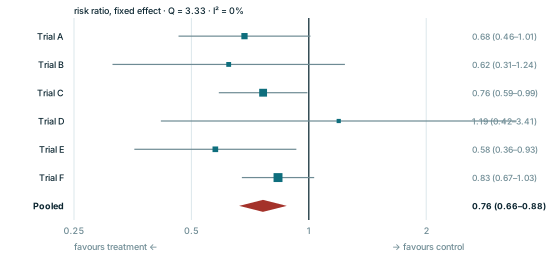
Every panel is redrawn from its own equation by scripts/glossary-figures.js — no traced or stock artwork, and a rebuild is byte-identical.